数据透视表III―更多可选择、更简洁精美的样式
PivotTables part 3: More clickable, more compact, and nicely styled
数据透视表3:更多可选择、更简洁精美的样式
Today, I would like to cover some of the improvements we made in Excel 12 to make PivotTables easier to read and explore.
今天,我介绍一下Excel 12的一些改进,这些改进使得数据透视表更易于阅读与理解。
Expand Collapse
One of the nice
exploration features of PivotTables is the ability to expand and
collapse items in order to view values at different levels of detail. In
Excel 12, we have added expand/collapse indicators to the PivotTable to
make it easy to discover when there are more details to explore (and to
make it obvious that this feature even exists!). The expand indicator
is a “+” and the collapse indicator is a “-”.
展开折叠
数据透视表中一个值得探索的特征就是展开和折叠项目的功能,使用户能够按照不同的明细等级察看数据。在Excel 12 里,我们给数据透视表增加了展开/折叠指示器,让用户很容易就能看出是否含有隐藏的明细数据。这个展开指示器是一个“+”,折叠指示器是一个“-”。
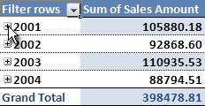
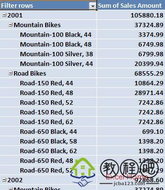
Let’s look at an example. In the
PivotTable below, I have added three fields to the row area and the
sales amount field to the values area. Currently only items of the first
field, year, are showing. To display the details below 2001, all I have
to do is to click the expand indicator:
让我们来看一个例子。在数据透视表的下面,我已经添加三个字段到行区域,销售额字段添加到值区域。通常只有第一个字段的项目“年份”显示出来。为了显示2001下面的明细数据,我们需要点击展开指示器。
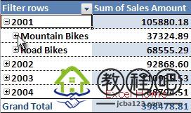
And now I’m looking at the sales amount for each product category in 2001:
现在,我们可以看到2001下面每一个产品种类的销售额:
To go to a lower level of detail, I can expand mountain bikes as well and I get the sales amount for each bike model:
为了看到下一级明细数据,我可以展开“山地自行车”,从而得到每款自行车的销售额:
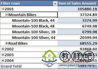
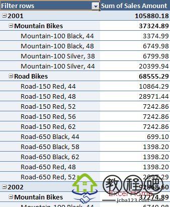
Note that I am now at the lowest level
of my “hierarchy”, so there are no expand or collapse indicators. The
indicators do not print by default, and they can be turned off
altogether once you are done exploring the data and are getting ready to
present the result.
我现在位于最底级的层级里,所以这里没有展开或折叠指示器。指示器在默认的情况下是不会被打印出来的,一旦你完成探究这些数据并做好显示结果的准备,那么这个指示器就会自动关掉。
Compact Axis
Many of you have
probably noticed that the PivotTables in Excel 12 look more “compact”
than a PivotTable in current Excel versions. Probably the easiest way to
explain this is with a few pictures. Here is an Excel 12 PivotTable
with three fields on the row axis.
Compact Axis
大家可能已经注意到Excel 12 的数据透视表看起来比当前的Excel版本的数据透视表更加紧凑。图片就是最好的证明。这是一个Excel 12 的数据透视表,在行轴上有三个字段。

And here is the same PivotTable in Excel 2003.
下面是同一个数据透视表在Excel 2003中的样子。
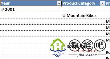
To significantly improve the
readability of PivotTables, we have added a new layout option for
displaying items in the row area, which the team refers to as “compact”.
In the Excel 12 screenshot above, you’ll notice that items from all of
the three different fields in the row area are displayed in a single
column. To distinguish between items from different fields, Mountain
Bikes is indented under 2001 and the individual mountain bike models are
indented even further under Mountain Bikes. One of the key benefits of
this feature is that PivotTable row labels take up far less room on your
screen, so that there is much more room for your numbers.
为了有效的改进数据透视表的可读性,我们增加了一个新的布局选项,它可以显示行区域的项目,这组选项称为“compact”。在上面的Excel 12
截图中,你会注意到行区域中的三个不同的字段的项目显示在同一列上。为了区别不同字段的项目,山地自行车在2001下面缩进,而各种山地自行车款式也在山地自行车之下再缩进。这个特征的主要好处就是在你的屏幕中数据透视表的行标签占据更少的空间,所以有更多的空间让你放置你的数据。
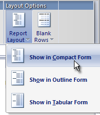
This compact form is the new default
layout for PivotTables in Excel 12. That said, we have provided three
different “row area layout options” to choose from. The layout settings
can be controlled for each field individually but it is very easy to set
them for all fields at once. This is done in the Report Layout drop
down on the PivotTable Styles tab.
这个紧凑形式是Excel 12 数据透视表的新的默认布局。也就是说,我们已经提供了三种不同的“行区域布局选项”。在布局设置里可以控制每一个字段,而且很容易调整各个字段的位置。这个命令已经设置在数据透视表样式标签的报告布局的下拉列表里。
In addition to the compact form that we
have already looked at, the tabular form displays one column per field
displayed and leaves space for field headers. Here is what the tabular
form looks like for the same PivotTable – much like current versions of
Excel.
紧凑形式我们已经看到了,除此之外,还有平板形式,平板形式的每一种字段显示一列,剩下的空格作为字段标题。这就是平板形式看起来很像当前Excel版本的数据透视表的原因。
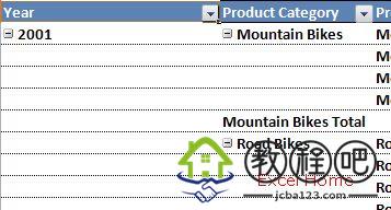
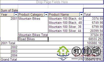
The outline layout is very similar to
tabular except that you can have subtotals at the top of every group,
since items in the next column are displayed on row below the current
item. To illustrate the difference, the screenshot below shows outline
form where Mountain Bikes is one row below 2001:
大纲形式与平板形式很相似,只是大纲形式在每一个分组的顶端有一个小计,而且下一列的项目显示在前一列项目的下一行。举例说明它们之间的差别,下面的截图显示在大纲形式下山地自行车在2001的下一行:
As the screenshots above illustrate,
the great advantage of the new compact form is that the PivotTable
utilizes space a lot better, making it much easier to read. Tabular and
outline form include a lot of white space making the report wider and
the result is that the values are pushed out of view in many cases.
上面的截图表明,新的紧凑形式的最大优点就是数据透视表能够充分利用空间,更易于阅读。平板形式和大纲形式包含许多空格使得报表很宽,造成数据被挤出我们的视野。
PivotTable Styles
Back in November,
I wrote a post on a feature we added to Excel 12 called table styles.
Table styles provide a way a way to quickly format entire tables using a
preset style definition. They are dynamic, meaning as your data change
the style is re-applied smartly, there is a lot of variety, the UI for
applying table styles is very visual and easy, and they will be
professionally designed, so that out-of-the box people will be able to
create presentation-level quality.
数据透视表样式
2005年11月,我写了一篇关于Excel 12 列表样式的文章(table
styles.)。在列表样式中,用户可以事先定义好各种列表样式,然后利用这些样式快速格式化整个列表。这是动态的,意味着当你的数据改变时,样式也会随之调整,这有许多种变化,应用列表样式的用户界面看起来也栩栩如生,并且可进行专业化设计,使得外行人也能够创建高质量的报表。
Well, the good news is that we have
done the same for PivotTables. In Excel 12, we have added PivotTable
styles, which are another important part of our work to make PivotTables
easier to read and understand. In the same way as table styles, the
PivotTable UI offer styles in a gallery.
我们也为数据透视表做了同样的工作,这是一个好消息。在Excel 12 里,我们增加了数据透视表样式,使得数据透视表可读性更强,这也是我们工作中的另一个重要部分。和列表样式一样,数据透视表用户界面也提供了一个样式展台。
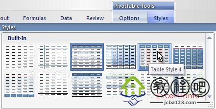
Clicking a style in the style gallery
will immediately apply the style to the entire PivotTable. Below are two
examples of PivotTable styles. The first example is a style that
highlights the top part of the report while formatting everything below
similarly:
在样式展台中点击一个样式就会立即将这个样式应用到整个数据透视表。下面是数据透视表样式的两个例子。第一个例子的样式是突出显示报告顶部,也同样格式化下面的所有明细条款。
The next example demonstrates that you
can make each group stand out to make it easier to find subtotals in the
report. In this example, 2001 and Mountain Bikes are in bold text since
they represent subtotals whereas the individual mountain bike models
are in regular text since they are at the lowest level of detail.
第二个例子表明:你可以突出显示每一组项目,使得小计部分在报告中显而易见。在这个例子中,因为2001和山地自行车后面显示小计的结果,所以这里以粗体字体显示,而山地自行车的款式则以正常的字体显示,因为它们在明细数据中等级最低。
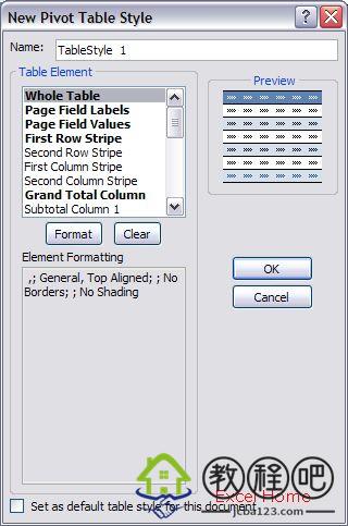
Excel 12 will come with a large set of
predefined PivotTable styles that you can pick and choose from. In
addition, just like table styles, you can create your own styles that
fit your specific needs whether that might be corporate guidelines or
individual preferences. PivotTables, however, are more complex than
tables, so there are more table elements available for users to define
formatting on. For example, you can define formatting for multiple
levels of subtotals, you can define striping at different levels in the
PivotTable. (UI is not final.)
Excel 12
将会自带很多预先定义的数据透视表样式供你选择。另外,就像列表样式一样,不管是公司的统一风格还是个人的偏爱,你都可以创建自己的样式以适合你的特殊需求。然而,数据透视表比列表更加复杂,所以有更多的表元素可提供给用户定义数据透视表的格式。例如,你可以为多级汇总定义格式,你可以在数据透视表的不同级之间定义条纹。
We think that users will really enjoy
this feature – once a style has been applied to a PivotTable, the
PivotTable continues to look good through sorts, filters, pivots,
addition or removal of fields, etc.
我们认为用户会真正的喜欢上这个特性——一旦某种样式已经应用于某个数据透视表,那么这个数据透视表就会继续贯穿着排序、筛选、转置、添加或删除字段等等。
Next time up, a bunch more features that make PivotTables easier to read and explore.
下次,介绍数据透视表更多的特性,这些特性让数据透视表更易于理解和学习。
Published Tuesday, December 13, 2005 9:03 AM by David Gainer