透视表终曲_值字段技巧(一)
Pivot Tables grand finale: Tricks with the Values field
透视表终曲:值字段技巧
This is going to be the last PivotTable
post, at least for a while. Unlike the last several posts, the subject
matter that follows applies to any PivotTable, not just those connected
to SQL Server Analysis Services.
这是本阶段内最后一篇关于透视表的文章了。和前几篇文章不同,本主题相关的应用不只是用于连接到SQL Server Analysis Services的,而是任何透视表。
In current versions of Excel, one of
the capabilities that exist in PivotTables is the ability to adjust the
position of the labels that describe the values in the Values region of
the PivotTable (i.e. “Sum of Sales”). Excel PivotTables offer
significant flexibility in this area – the labels can be on rows, on
columns, and anywhere in the hierarchy on either of those areas. When we
visit customers to talk to them about how they use PivotTables, though,
we see a couple of things. First, the majority of users aren’t fans of
our initial placement of the labels. Second, most people have never
figured out that the labels can be repositioned. We have tried to
address both of these items in Excel 12.
在这个版本的Excel中,透视表的一个功能就是,用于描述透视表(例如”Sum of
Sales”)中选定范围内值的标签的位置是可以改变的。这一点上Excel透视表非常的灵活,标签可以被放在行,列,或者那些区域层级的任意位置。当我们去客户那里,告诉他们怎么使用透视表的时候,通常,我们会遇到两种情况。一种是,大多数用户不喜欢标签的初始位置。另一种,多数客户根本不知道这些标签是可以移动位置的。我们已经试着在Excel12中解决这些问题了。
This area is probably best explained by
walking through an example, so here goes. To start with, imagine you
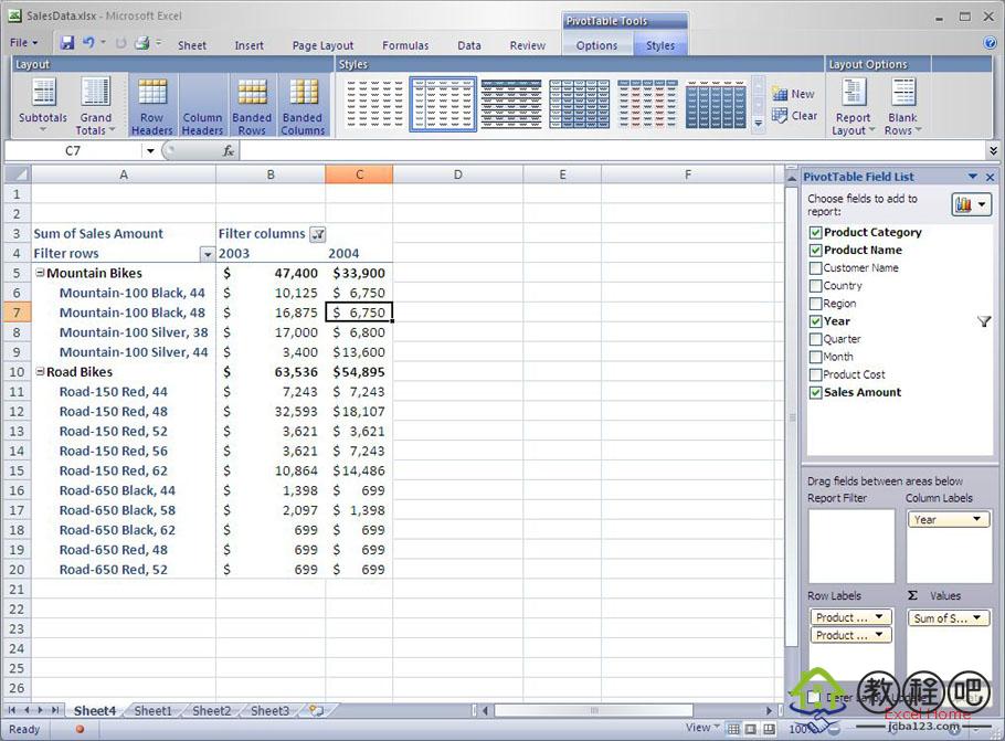
were building the following PivotTable. It has some items on rows and
columns, and Sales Amount summarized in the Values area.
看一个例子,应该是解释这个问题的最好的方式,所以:),here goes。开始,想象一下你原来做下面这张表的时候。列和行上都有一些项目,后面的计算区域还有销售统计额。
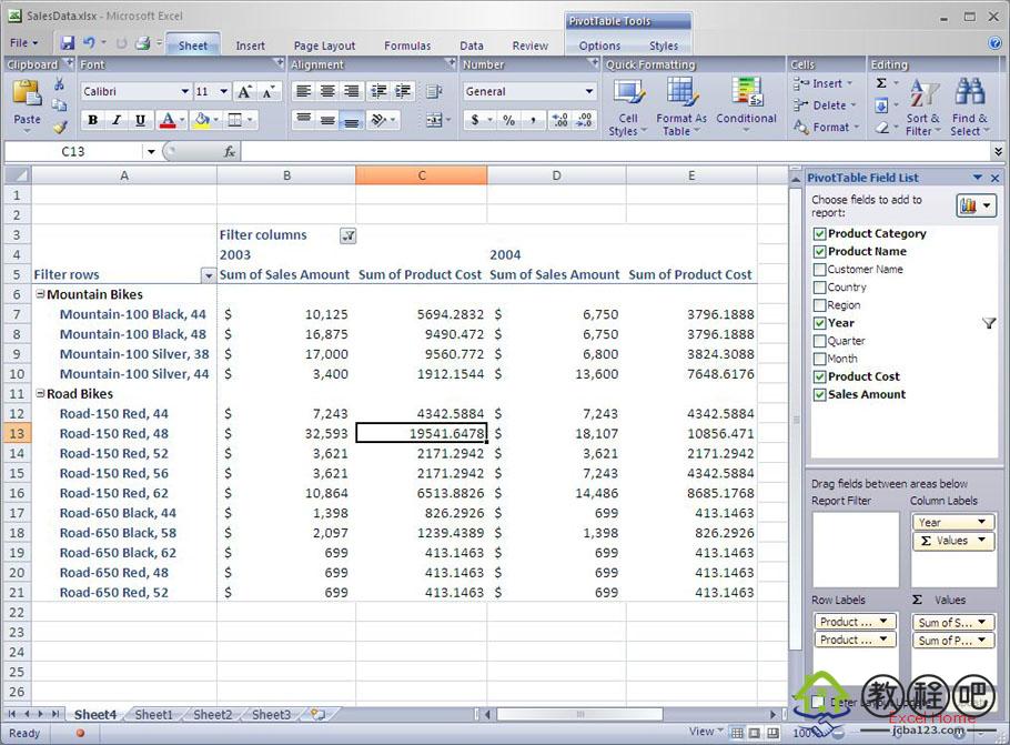
If you add a second field to the Values
area – say Product Cost – then Excel adds some captions (“Sum of Sales
Amount”, “Sum of Product Cost”) below the years (“2003”, “2004”) to help
the user distinguish which numbers are Sales and which numbers are
Product Cost.
当你增加另一个字段到数值区域,计算Product
Cost,Excel就会在年度(”2003″,”2004″)下面加上标题(”Sum of Sales Amount”,”Sum of
Product Cost”)以帮助用户区别哪些数字是Sales哪些数字是Product Cost。
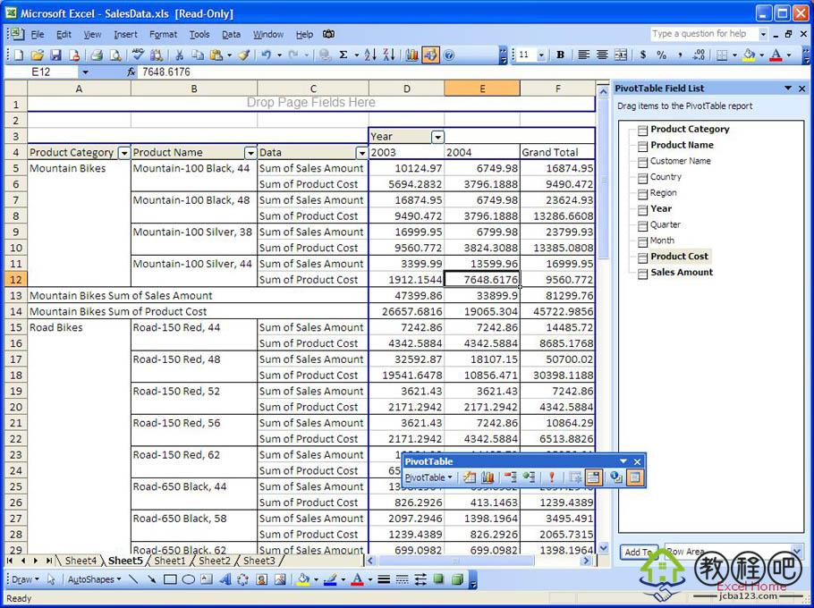
Those of you familiar with PivotTables
have probably already spotted one change from current versions of Excel.
In current versions of Excel, the captions are placed in the Row area,
not the Column area. Here is a visual of what that looks like.
如果你熟悉数据透视表的话,也许已经看出这个版本的Excel发生了什么改变了。在这个版本的Excel中,标题被放在了行首,而不是列。如下:
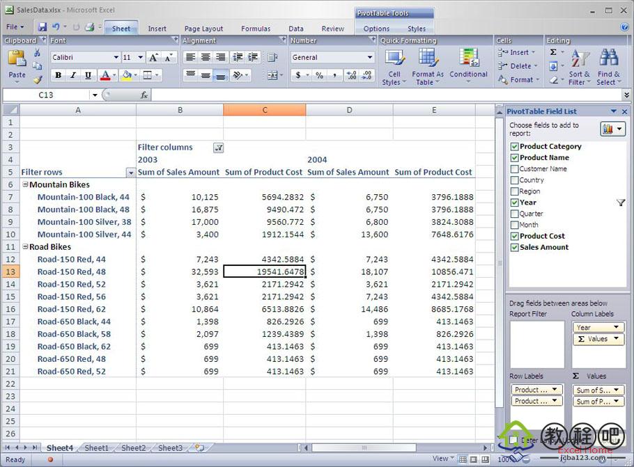
This one change – putting the labels on
columns and not rows when a second field is added to the Values area –
makes PivotTables with multiple items in the Values area more readable,
and was the default positioning that most users wanted. So far, feedback
on this one small change has been very positive.
当有更多字段被放在计算区域的时候,标签将显示在列上而不是行上,这样的一个改变,使得有多个数值的透视表更具可读性,并且,这也是大多数用户想要的。到目前为止,这个小改变的反映非常良好。
As I said above, PivotTables are
flexible enough to show the labels at any point in the hierarchy on
either the Row or Column areas . To move the labels around in current
versions of Excel, you can drag and drop a “Data” field in the Excel
grid. This is not terribly obvious, though, and those folks that did
spot this capability often had trouble putting the labels at the point
in the hierarchy that they wanted. In Excel 12, we have tried to make
this a more straightforward task by putting a field for the labels in
the Drop Zone area of the field list that people can move around exactly
like any other field. So, when you add more than one field to the
Values area, we add a field labeled “∑ Values” to the field list,
initially in the Column Label area.
如我上面说的一样,现在的透视表已经非常灵活,随便你把标签放在行还是列上了。在这个版本里,直接在Excel表格里拖拽”Data”字段就可以移动标签了。对于那些经常在移动标签时遇到困难的用户,这显然是小菜一碟了。在Excel
12中,我们试着让这个操作更加简单,用户只要为字段表的拖放区域中的标签再写一个字段,就可以像其他字段一样随便移动了。所以,当您增加一个或多个字段到数值区域的时候,我们就会在这些字段列表标签的开头加上”∑
Values”。
We don’t show this field until you add a
second field to the Values area because we don’t put captions in the
PivotTable until there are multiple items in the Values area.
当您在数值区域里放置第二个字段的时候字段标题才会显示出来。这是因为我们不希望在透视表里加数值标题,除非里面有多个项目。