图表二_专业图表轻松做(续)+Excel2007键盘访问模
Charting II – Professional charts, made easy (continued) + Excel 2007 keyboard access model …
图表二: 专业图表轻松做(续)+Excel2007键盘访问模式
Keyboard Access
Today I want to
start with a link to Jensen Harris’ UI blog, where Jensen has put up a
post that describes the Office 2007 keyboard model. I am personally a
big keyboard user, and I know the same is true for a lot of Excel users,
so this is a topic that is near and dear to my heart. You can read the
details for yourselves, but I want to summarize the key design points.
·Every
one of the Office 2003 keyboard shortcuts (i.e. CTRL+B) continues to
work the same in Office 2007; there’s no relearning necessary.
·All
of the Office2003 menu accelerators (i.e. ALT+I+R to insert a row) will
work just like you were running Office 2003 … no need to activate any
sort of legacy keyboard mode or anything like that – your menu
accelerators just work (note, for the beta users out there, this is a
change from beta1). This is very useful for those of us that have
memorized menu accelerators over our lives using the product.
·Every
single command in the Ribbon receives a letter – a KeyTip – which is
used to activate that command via the keyboard. Basically, when you
press the Alt key, the keytips show up on the ribbon, and you then
simply need to press the appropriate letter to execute the command. Here
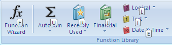
is a picture of the keytips on the formulas tab.
键盘访问
今天我将通过Jensen Harris的博客介绍Office 2007键盘模式. 我个人经常使用键盘,我知道有很多Excel的用户也一样,所以这是一个亲切的主题。你可以自已阅读相关的细节,这里我仅说明设计的要点。.
·在Office 2007中继续延用 Office 2003的键盘快捷键(比如CTRL+B),这就不用再学习了。
·所有Office2003的菜单快捷键(比如用ALT+I+R插入一行)继续延用,不需要为传统键盘模式或菜单快捷键重新分类 (注,试用版除外,这与Beta1相比是个改变)。在使用中不用再背菜单快捷键,这对大家是非常方便的。
·当Ribbon上的个别命令收到一个字母 – 一个关键首字母 – 即通过键盘来执行命令。基本上,当你按下Alt键, Ribbon上就会出现命令首字母,然后你只需按下适当的字母来执行指令,下图介绍的是一个函数选项卡上的命令首字母。
(Click to enlarge)
Again, for beta1 users, this is
different from what you have seen. To quote Jensen: “The feedback we got
from Beta 1 on the KeyTips was loud and clear: good idea, but the
KeyTips key sequences are too long and inefficient compared to the old
menu accelerators. So, we went back to the drawing board and looked at
how we could shorten KeyTip sequences to be as short as possible. We
removed an extra keystroke everywhere by no longer requiring you to type
the KeyTip for the group a control is in. And, we did away with most of
the two-letter KeyTips by adding numbers as potential KeyTips for very
dense Ribbon tabs. The result? We ran an analysis of every single
command in Office 2003 and Office 2007–and the average ‘keystroke
length” to access a command has gone down considerably. And for
frequently-used commands in Office 2007, most are accessible with Alt +
two keystrokes, just like the top-level menu commands in Office 2003.”
然而,对beta1用户来说与所看到的有所不同。Jensen指出:”从Beta
1获得的反馈:命令首字母大而清晰非常好。但关键首字母的组合太长,比旧的菜单快捷键效率要低。
所以,我们回到图板,看如何缩短关键首字母序列,越短越好。我们去除了一个多余的键,输入快捷键不再通过命令组了,
并且为Ribbon上较密的大部分两个字母的标签增加了替代字母。结果呢? 我们分别在Office 2003 和 Office
2007中运行每一个单独命令进行分析:运行一个命令的平均按键次数大为降低,在Office 2007中几乎接近Alt +二次按键,就像Office
2003中高效的菜单命令一样。
I am interested to see feedback on
these new designs as people get their hands on beta2, but I am pretty
sure this represents a big step forward for keyboard access and the
ribbon.
我非常想看到用户对于新设计的beta2快捷键的反馈信息,但我肯定键盘访问和ribbon是很大的改进。
Back To Charting …
Last post, we
discussed how we have tried to make it easier to create good-looking
charts by providing users with four straightforward choices.
Specifically, the choices are: chart types, chart layouts, chart styles,
and document themes. The second two are covered in this post – the
first two are in the previous post.
回到图表
上一贴,我们讨论了如何设法使人们更容易创建精美的图表,向用户提供简单的四步选择。具体而言,就是选择: 图表类型,图表版式,图表样式,文档主题.接下来的二步就在本贴介绍(这是上一贴的二步)。
Chart Styles
The third major choice
for creating a chart in Office 2007 is the chart style. I recently
covered cell, Table, and PivotTable styles. Probably to none of your
surprise, we have also added styles for Charts (and PivotCharts). The
user model is the same for charts as the other objects that support
styles – the user simply needs to select a chart and then pick from a
set of available styles using a gallery in the ribbon. For example, here
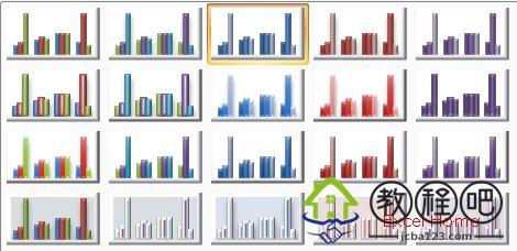
are the styles just for 2D clustered column charts in current builds.
图表样式
第三个主要步骤是在Office
2007中创造图表样式。我最近介绍了单元格、工作表、数据透视表的样式,也许你并不感到惊奇,我们将介绍的图表和数据透视图的样式。于图表来说和其它对象的使用模式是相同的,
用户只需要选中一个图表,然后在ribbon上选择内置的一种图表样式。例如,下图是现在内置的2D风格的柱形图。
(Click to enlarge)
For other chart types, the styles look
somewhat different, as you might expect. The styles vary widely from
simple, flat styles with solid colours to more showy styles with bevel
effects or shadows. The styles use colours from the document theme,
either a variety of tints of shades of a single colour from the theme,
or using all the colours from the theme. The overall goal is to provide a
wide gamut of designs, so that users can create very simple or very
showy charts quickly and without a lot of fiddling. The one key
difference between chart styles and cell, Table, and PivotTable styles
is that users cannot create their own chart styles – for Excel 2007,
they will be limited to the several hundred that ship in the box.
对于其他图表类型,正如你期望的这种样式稍微有些不同.
这种样式由于简单,用平面风格和过渡颜色加上倒角和阴影,显得非常炫。这种样式从文档主题中设置颜色,
从文档主题中选择渐变色或所有的颜色。总之,提供了一个全方位的设计,使用户可以快速创建非常简单、非常炫的图表。在图表样式和单元格、列表、数据透视表样式间有一个主要区别是:用户不能创建自己的图表样式-Excel2007中只能局限于几百个内置图表样式。
Document Themes
We have already
discussed Document Themes in a number of posts. Charts use Document
Theme information in pretty much the same way as Table and PivotTable
styles – they pull their colour and font information from the Document
Themes. In addition, charts use the lines, fills, and effects
information from the theme that as well. Accordingly, your chart will
automatically match the text, tables, shapes, and diagrams elsewhere in
your document. Change themes, and your chart will change along with the
rest of your document. Move your chart to another document, and you can
choose to match the destination theme. More on that second point in a
later post.
文档主题
我们在一些贴子里已经讨论了文档主题,在图表中使用文档主题和在表格、数据透视表中类似:从文档主题栏设置颜色和字体。此外,在图表中设置线条,填充色和效果也很好。从而令你的图表自动与文本、表格、自选图形和其他图表相匹配。修改主题取决于你的文档,把图表移到另一个文档时,可以选择适合目标主题。在下一个贴子中再谈第二点。
Summary
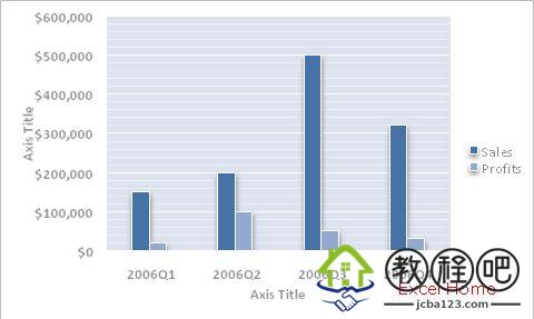
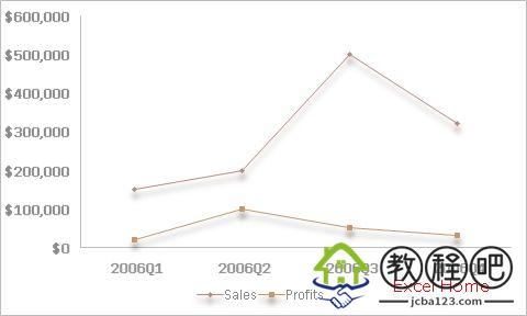
To show the wide variety of
results from these four choices, I took the same data set and created
pictures of it with two chart types, two chart layouts, two chart
styles, and two document themes. Each of these charts is only four
choices away from the original data set. You may have your favourites,
but hopefully all of them are professional-looking charts. One other
thing to keep in mind – a large number of charts created in Excel end up
in PowerPoint, where dark backgrounds and contrasting colours are
important for projection, so that should help explain some of the styles
you see below.
概要
分四步创建各种图表,我曾用同一组数据作图,分别选择两种图表类型,两种图表版式,两种图表格式,两种文档主题,每个图表从原始数据选中开始仅用了四步。每个人都有最喜欢的图表,但希望这些都是精美的专业图表。记住另一件事,在Excel中创建一大批图表最后用在PowerPoint中,在投影片中使用深色背景和对比色是非常重要的,将有助于突出主题,见下文。
(Click to enlarge)
(Click to enlarge)
Next time – the chart contextual tabs.
下次介绍关于图表的选项卡。
Published Wednesday, April 12, 2006 5:12 PM by David Gainer