选项卡和模板
译者:snood 来源:http://blogs.msdn.com/excel
发表于:2006年7月7日
Charting III – Tabs and Templates
In the previous two charting posts, I wrote about how you can make a professional chart with four simple choices – chart type, chart layout, chart style, and document theme. As useful as we hope that is, we know that some users will want to tweak and control every aspect of their charts. Today I want to walk through the tabs that are available when you are working with a chart and provide an overview of all the capabilities that are exposed in the ribbon. I am also going to briefly cover templates.
图表三:选项卡和模板
在前两个贴子里,我写了如何通过4个简单步骤创建专业图表:图表类型、图表版式、图表样式、文档主题。希望对你有益。我们知道有些用户想从各个方面来调节图表。今天我想通过ribbon上的图表选项卡来介绍图表设置。我也会简要介绍一下模板。
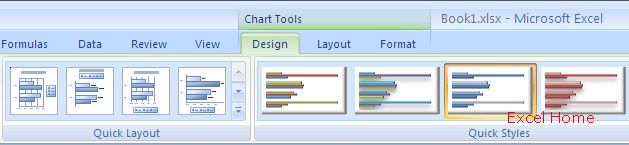
Design Tab
When you are working with a chart, three additional contextual tabs will be available – Design, Layout, and Format. Here is a shot if the Design Tab.
设计选项卡
当你制作图表时,有三个选项卡可用:设计、样式、格式。下图是设计选项卡。
(Click to enlarge)
The Design tab allows users to set the style and layout of a chart. In addition, this is where you change the chart type, change the data source, move the chart, and a few other things. The bulk of this was covered in previous posts.
用户可以通过设计选项卡设定图表版式、图表样式。此外,还可改变图表类型,改变数据源,移动图表及其他一些设定,大多数在以前的贴子中介绍过。
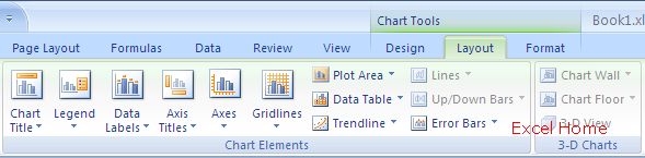
Layout Tab
The chart layout tab contains easy access to the various elements of a chart – title, legend, axes, series, data labels, etc. Each element has its own gallery of simple choices to construct charts. Most of these choices were available in previous versions of Excel, but you had to find the correct dialog to use them. With the ribbon, these choices are much more accessible and results-oriented.
版式选项卡
图表版式选项卡可以方便地设置各种图表元素:标题、图例、轴、数据系列、数据标志等。每个图表元素都可以从自己的图形目录中选取样式,大多数选项在以前的Excel版本中已经使用了,但你必须找到正确的对话框来使用。现在用ribbon有更多的选择和预览效果。
(Click to enlarge)
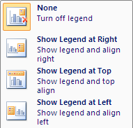
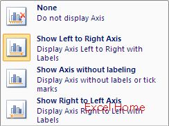
Here are examples – one for legends, and the one for an axis. The legend gallery gives you a choice of places to put the legend. The axis gallery gives you a choice of how you would like to see the axis. Other galleries give choices for data label position, category axis direction, and gridline patterns.
有两个例子:一个是图例的,一个是轴的。从图例图形目录中可以选择图例的位置,从轴图形目录中可以选择可见的轴。其他图形目录还可选择数据标志的位置,分类轴方向和网格线模式。
(Click to enlarge)
Note that the galleries have a “More Options …” choice at the bottom. The goal of the galleries is to make it easy to apply common settings with one click. Since not every capability would fit in these galleries, so there is still a format dialog for each chart element, much like in previous versions of Excel, which is launched when the user selects “More Options …” This gives the user the finest level of control over the features. (The format dialog is now modeless, so you can click to other elements and change their formatting. Also, the choices have also been rearranged somewhat, trying to make them fit better together.)
注意图形目录最下面有个”更多选项…”,使用图形目录的目的是通过一次点击方便地进行设置。因为不是每功能都能放在图形目录中,所以针对每个图表元素还设置了一个格式对话框。当用户点击”更多选项…”时就会出现对话框,象以前Excel版本似的,这可以充分发挥用户的设置格式水平。(格式对话框是非模态对话框,可以点击其他元素并设置格式。这些选项也可以重新排列,试试排列得更合适些。)
By now, you are probably getting a sense as to the “three level” approach that the ribbon affords us. At the top level, users can select from galleries on the Design tab (chart layout, chart style) that to create a wide variety of charts very simply. If users then want to do more detailed tweaking, they can move to the Layout tab, where they can manipulate the objects on the chart, again using very visual, results-oriented galleries. And, for those folks that want even more fine-grained control, there are modal dialogs with every available setting.
现在,你大概就越来越感到ribbon 提供的”三个层次”的方法。最高层,用户可以在设计选项卡的图形目录里选择(图表版式,图表样式) 非常简单地创建各种图表;如果用户想进行更细的设置,可以转到图表样式选项卡中,再利用非常直观、预览结果的图形目录设置图表上的对象;如果要进行更细致的设置,可以通过格式对话框进行各种设定。
Format Tab
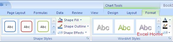
The Format tab is based on the Format tab used for shapes (which I haven’t yet covered in a post, but I will at some point). You can choose any chart element, and format it just as though it is an OfficeArt shape.
格式选项卡
格式选项卡是基于图形的格式(在我的贴子里还没有介绍,但我会在合适的时候介绍的)。你可以选择任何图表元素,通过艺术字的形状调整格式。
(Click to enlarge)
This includes control over the fill: 16 million colours, transparency, gradient fills, and texture and picture fills. It also includes control over the lines: 16 million colours, transparency, dashing, compound lines, arrows, and even cap and join settings. Effects, such as shadow, glow, soft edges, and bevel, can also be accessed from the Format tab. All of these are drawn using OfficeArt, so they are high quality and look consistent. OfficeArt draws smooth antialiased lies, which makes line charts look so much better. 3-D charts are drawn with OfficeArt 3-D, including antialiasing, lighting, shadows, and materials. In a post from a few months back, you can see many of these effects on charts.
The Format tab also includes WordArt effects for text. If you want your chart title to glow or look chiselled, the WordArt effects enable it. The text is drawn with ClearType, making it much more readable than text on charts in previous versions, especially at smaller sizes.
填充色选项包括:1600万种颜色、透明度、渐变、纹理和图片填充。线条选项包括:1600万种颜色、透明度、虚线、复合线、箭头,平头,接合点等。效果选项包括:阴影、发光、羽化、倾斜,也可以直接使用格式选项卡。所有这些都使用了OfficeArt,所以效果很好并且颜色协调。 如果要让折线图更好看可以用OfficeArt画平滑线,好多了. 3D图表可用3D OfficeArt绘制,包括平滑、照明、阴影和材质。在几个月前的一个贴子中,可以看到许多图表效果。
格式选项卡也包括文本艺术字,如果你想让图表标题发光或看上有凿痕,使用艺术字效果就行了。该文本使用透明类型,比以前版本的图表中文字更好看,尤其是文字较小的时候。
Templates
Finally, a quick word about templates. Once you have a finished designing a custom chart to look just like you want it, you can save it as a template. This is similar to the custom chart types of previous versions, but we have exposed the feature a bit more carefully (both on the ribbon and in the Create Chart dialog). Also, the templates are stored as separate files in a directory, making it much easier to share them from user to user or machine to machine. Finally, for those interested in the new file formats, templates use the same schema as charts.
模板
最后一个关键词是模板。你可以将一个以前设计好的自定义图表存为图表模板,这与在以前的版本自定义图表类型相似,但也有一点新的特色(在ribbon和创建图表对话框上都有)。 图表模板作为单独的文件存放在一个目录中,可以方便地在不同用户或不同机器间共享使用。 最后,可以在你的新文件中使用你感兴趣的模板创建图表。
Published Thursday, April 13, 2006 1:43 PM by David Gainer
注:本文翻译自http://blogs.msdn.com/excel ,原文作者为David Gainer(a Microsoft employee),Excel Home 授权转载。严禁任何人以任何形式转载,违者必究。